Best Shutter Colors for Every Home Style
Choosing the right shutter color isn’t just about matching the paint on your walls—it’s a subtle art that combines mood, lighting, and architectural harmony. One wrong hue can clash with your home’s design, while the perfect shade can turn your space into something straight out of a designer magazine. But how do you navigate the color wheel when there are thousands of tones to choose from?
Shutters are a defining feature of both interior and exterior aesthetics. They frame your view, filter your light, and contribute to the ambiance of every room they’re in. Whether your space is modern and minimal or warm and rustic, the color you choose for your shutters has the power to amplify or soften those design choices. Color speaks louder than people realize—especially when it’s part of a permanent feature like shutters.
There’s more at stake than just personal taste. Color trends, home resale value, and even natural lighting all play into this surprisingly impactful decision. From soft neutrals that play nice with everything to bold hues that make a statement, let’s explore the real-world rules and secrets behind finding the perfect shutter color.
How Color Influences Mood and Perception
Color isn’t just visual—it’s psychological. Studies show that color influences how people feel in a space, often without them even realizing it. Warm tones like terra cotta or soft beige create a cozy, inviting atmosphere, while cooler shades like pale gray or icy blue evoke calm and clarity.
Data Insight: According to a study by the National Association of Home Builders, 62% of homeowners said neutral tones helped rooms feel larger and more inviting.
Light also affects color perception. South-facing rooms bring out warmer tones, while north-facing spaces tend to cool down hues. This means the same shutter color can look dramatically different depending on placement.
Popular Shutter Colors for Timeless Appeal
Classic doesn’t have to mean boring. Some shutter colors have stood the test of time for good reason—they simply work.
Top enduring choices include:
- White – Clean, bright, and versatile; perfect for coastal, farmhouse, and minimalist homes
- Charcoal gray – A sophisticated neutral that works with both cool and warm palettes
- Espresso brown – Rich and traditional, especially on wooden plantation shutters
- Soft taupe – Understated and modern without feeling sterile
These shades also provide flexibility when you update furniture or wall colors, making them ideal for long-term homeowners.
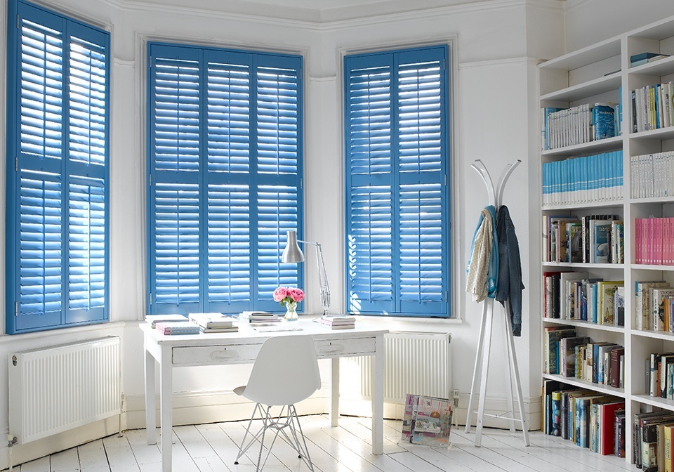
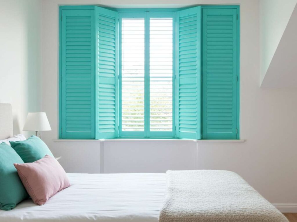
Using Bold Colors to Make a Statement
Some homeowners want their shutters to be more than a backdrop—they want them to shine. Accent colors can make shutters a central design feature.
Bold doesn’t mean chaotic
When done thoughtfully, deep navy, forest green, or even muted mustard can add depth and drama without overwhelming a room. The key is balance. If walls are neutral, bolder shutters can add excitement and sophistication.
Example: A mid-century modern home with clean white walls and teak floors pairs beautifully with rich olive green shutters—bringing in earthy color without breaking design cohesion.
Matching Shutters to Your Home’s Architecture
Color should always respect the lines and character of the home. Victorian homes, for instance, often look stunning with dark green or burgundy shutters, while Mediterranean-style homes pair well with warm clay or terracotta tones.
| Architecture Style | Recommended Shutter Colors |
| Colonial | Navy, Black, Forest Green |
| Modern/Contemporary | Matte Black, Gray, Soft White |
| Cottage/Farmhouse | Cream, Sage, Duck Egg Blue |
| Spanish/Mediterranean | Terracotta, Rust, Sandy Beige |
Considering architecture ensures the color adds authenticity rather than visual conflict.
Exterior vs Interior Shutter Color: Should They Match?
This is where many homeowners get stuck. The answer? They don’t need to match—but they should relate.
- Exterior shutters contribute to curb appeal, so prioritize cohesion with the siding, roof, and trim.
- Interior shutters serve mood and design flow, so they should align with your flooring, walls, and natural light.
Quick Tip: Keep the undertones consistent. If your interior color palette is cool (grays, blues), avoid warm-colored shutters and vice versa.
How Lighting Impacts Shutter Color Perception
Natural and artificial light can dramatically affect how your shutter color appears throughout the day. Morning sunlight tends to highlight yellow undertones, while LED light can make whites look blue.
Statistic to note: A study from the Lighting Research Center found that 80% of homeowners who didn’t sample paint or finishes under different lighting conditions regretted their choices.
Before finalizing your shutter color, test swatches under both natural and artificial light at different times of day to avoid surprises after installation.
Color Trends: What’s Hot in 2025?
Color trends evolve with lifestyle shifts. As of 2025, many homeowners are gravitating toward nature-inspired palettes that ground and comfort.
On-trend shutter hues this year:
- Clay and terracotta
- Misty sage
- Deep mineral blue
- Soft putty
- Mushroom taupe
Pantone’s 2025 Color of the Year, Future Dusk, is a moody blend of blue and violet that could inspire a new wave of shutter styles in modern homes.
Seasonal Influence on Shutter Color Choices
Your regional climate and seasons should also guide color decisions. In sun-heavy climates like Arizona or Southern California, lighter shutter colors help reflect heat and light. In contrast, homes in colder, cloudier areas benefit from deeper, richer colors that add warmth.
Fact: According to the U.S. Department of Energy, light-colored shutters can reduce heat gain by up to 45% in sunny climates.
Final Touches Make the Difference
Once you’ve chosen the right color, details like shutter hardware, surrounding trim, and nearby accents (like rugs or window treatments) can either elevate or disrupt your vision.
Try this:
- Match shutter hardware (hinges or rods) to door handles or light fixtures
- Use a similar tone in small decorative items for interior cohesion
- Paint trim a few shades lighter or darker than the shutters for visual depth
The Hue That Feels Like Home
Choosing the perfect shutter color blends science, style, and instinct. It’s not just about what’s trendy—it’s about what feels right when you walk into the room or pull into your driveway. It should enhance your space, not overwhelm it. And the most rewarding color choice will always be the one that makes your home feel unmistakably yours.
When was the last time a color made you stop and smile?